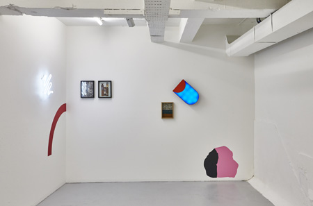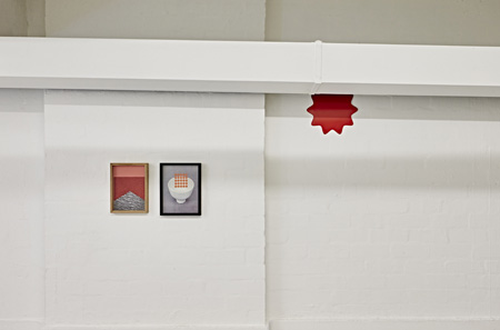
The collection ‘Circuit’ is in one way a beautiful archive. The twentieth century in art saw many artists re-sort and re-stage everyday things. It was perhaps the surrealists that brought the magic out of the “marvellous” thing, the found object that they called art. By the end of the twentieth century we had re-aestheticised the real. Duchamp was a little pissed off with the Pop artists who he felt had stolen Dada experiments in the an-aesthetic and made them pretty again; by the end of the century Jeff Koons and Haim Steinbach had made Warhol’s Brillo boxes look unfinished.
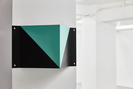
Elliott Bryce Foulkes plays at the limit of these debates and seems in away to return the readymade to the wall and painting (unlike Koons, Hirst’s vitrine or Steinbach’s shelf). One way that he does this is by using design motifs, typographies and logos that come from the visual designer’s arsenal. If the designers of the eighties borrowed heavily from minimalism and conceptualism Foulkes borrows them back, through design but back to art. The to-ing and fro-ing is not linear though, like postmodern histories, but in a characteristic mode of the contemporary, the work exists concurrently in the past, present and future.
This is not necessarily new to art. The great archivist of art history, Aby Warburg, used to present collections of images on walls much like Foulkes, in a form of visual essay that asked the viewer to look for connections back and forth through time. For example Nike of Samothrace’s wings become through the logo design of Carolyn Davidson the swoosh of the Nike shoe. If in 1971 Davidson was still referring to the goddess of victory, how has that reference change over time? The idea of victory may still be present under the surface or even formally the upward sweep suggests movement and vitality. Warburg called this connection, shifting and perhaps “declassing” over time the “afterlife of images”. In Circuit it is important to allow yourself, like a visual detective, to make links and find suggestions across and through the works.
So what is the position of irony and critique in this form of bricolage. Foulkes suggests, “I guess my impetus is to uncover rather than to critique; to celebrate thingness and highlight the objecthood of both the elevated and the overlooked.” There is no irony here, or parody, but really a general feeling of equivalence and horizontality: the swoosh is no more or less than canonical Nike’s. In Polymath the head of Aristotle becomes part of the collaged image but again, is this used in the same way Apple might use the term genius or a law school might have Aristotle on the wall to just sign “old, smart guy”? Warburg himself at the beginning of the twentieth century was not below looking at visual merchandising, posters and advertising as part of looking at visual culture or images in general. The images have a power that both advertising and art borrows from equally.
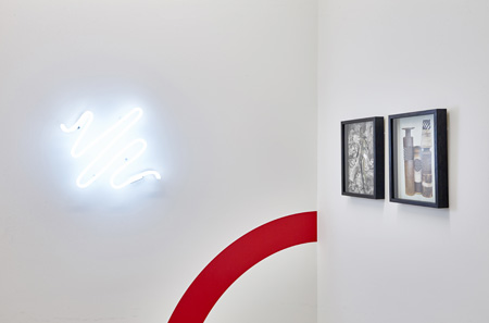
There is no doubt that Foulkes successfully brings this discussion back to art. As part of the joke in this series, the “scribble” is used as a sign of art’s gesture but here stripped of any direct meaning. The scribble neon on one hand reminds you of Tracey Emin’s scribbly handwritten neons but on the other hand here they are brought back to those corporate logos that use a scribble to suggest “creativity” (I seriously wonder whether this functions in exactly the same way in Emin’s work actually). Art and design are artfully conflated in Circuit. It is the perfect art for a world in which art can no longer really hold a privileged position, critically or culturally, against other cultural artefacts. Circuit just manages to show this state of affairs without the usual dissembling.


